In order to understand how to represent the world, designers developed a set of guidelines known as design principles. They serve as a guide for positioning graphic elements (such as shapes, colours, and lines) in the best way possible, in accordance with a particular intention, strategy, or objective.
When designing a user interface, it is critical to adhere to design principles because easy navigation and experience are essential for building good relationships with users.
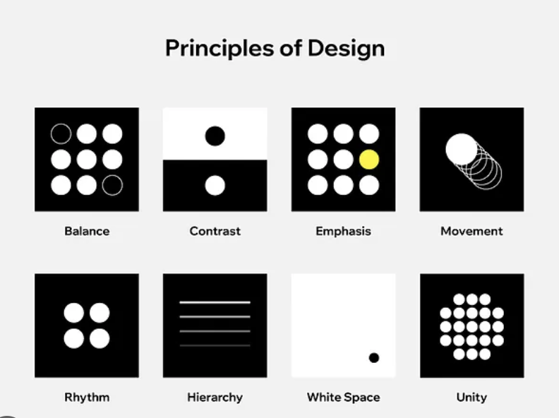
Design principles :
Balance – In design refers to how elements on different sides of a design are weighted against each other to create cohesiveness, completion, and engagement.
Contrast – It serves to distinguish different design elements from one another by showcasing their differences.
Emphasis – This technique makes certain design elements stand out from the rest. Additionally, it can be used to lessen how distinctive an element is.
Proportion – is the relationship between the sizes of the elements. Larger elements are frequently perceived as being more significant than smaller ones.
Hierarchy – Refers to the relative importance of design elements. The most important elements should be visible, and vice versa.
Repetition – Strengthens the concept or impression. It can be done by making similar decisions regarding things like the header format, colours, and images.
Rhythm – Regular or irregular spacing between elements can create a sense of rhythm. Rhythms can be used to evoke a wide range of emotions, such as calmness and excitement.
Pattern – The repetition of design elements is referred to as a pattern. It can also refer to design standards for specific elements such as navigation.
White space – Areas of a design without any design components are referred to as white space. This area is crucial for making a design uncluttered and for highlighting different elements.
Movement – It refers to how an individual’s eye moves over a design. The most crucial component would need to come after the second-most crucial one, and so on. Composition, emphasis, and other design principles can be used to achieve this.
Variety – It gives a design visual interest. It can be created through typography, colour image, textures and virtually any other design element. It keeps design from becoming repetitive and uninteresting.
Unity – This refers to how well a design’s components function as a whole. Each component should have a distinct visual relationship with the others in order to convey a message that is clear and concise.
Design principles in user interface
Clarity – It makes navigation enjoyable while enabling users to distinguish between interactive and static elements.
Familiarity – When user interfaces on websites are conventional, users can tell where things are on the site without having to look. This boosts user retention.
User control – it gives users the choice to go back a step when they believe they’ve made a mistake. For instance, whenever you create forms, give users the option to click the “Back” button to return to the page they were previously on. Don’t send them back to the home page or the beginning of the form.
Hierarchy – A successful user interface is built on a strong visual hierarchy, which is a key design principle. The method involves arranging visual components in a way that clarifies the relative importance of each component and directs users towards the desired action.
Important hierarchy elements:
Color: Vibrant hues stand out the most and can be used in restrained colour schemes to nudge users in a particular direction.
Size: When creating a visual hierarchy in user interface design, size is crucial. The element’s visibility increases with its size. Smaller components typically have less significance.
Font: To create visual hierarchy, experiment with different font sizes, weights, and styles.
Negative space: Important elements stand out and pop when there is too little of it.
References :
Chapman, C. Breaking Down the Principles of Design (with Infographic). Toptal Design Blog. https://www.toptal.com/designers/gui/principles-of-design-infographic#:~:text=There%20are%20twelve%20basic%20principles.
The 6 Key Principles of UI Design. Maze. https://maze.co/collections/ux-ui-design/ui-design-principles/#clarity (accessed 2023-03-24).