User interface the origin and the new…
The user interface industry has been around for a while, and it is now at its peak. Technology today is very advanced and much more catered towards human interaction.
The Xerox Palo Alto Research Center created the first computer-based interface in 1979 for Steve Jobs, who was looking for fresh concepts to incorporate into upcoming iterations of the Apple computer. They eventually created it, but nobody bought it because it was so expensive and still fairly new. In 1984, it underwent a redevelopment and was hailed as “insanely great.”
The development of the user interface can be divided into four eras: the age of tools, the age of machines, the age of software, and the age of the self.
The age of tool – Early humans started to communicate by carving images of animals and the natural world onto stone surfaces using simple tools. One of the earliest ways of communicating involved highly symbolic hieroglyphs. Later, art, writing, documentation, and storytelling would all incorporate this symbolism. The methods improved in refinement over time.
The age of mashines – Productivity was emphasised during the industrial revolution. Machines were created to facilitate work. It was a time when the primary “user interface” was still the hardware itself. The typewriter is an incredible example. Users would use their hands to tap physical keys to form words, substituting the typewriter for a pen while still using their hands. It helped save time and develop a format that was easy to use and quickly adopted.
The age of software- This period is very popular among artists and designers because it will have a significant impact on how we do things in the industries. With the advancement of technology, software was created to benefit from it and make things easier in industries. The Adobe Creative Suite is an excellent example because the interfaces were created to mimic how we would do things physically in the design industries, such as adding typography to letter pressing.
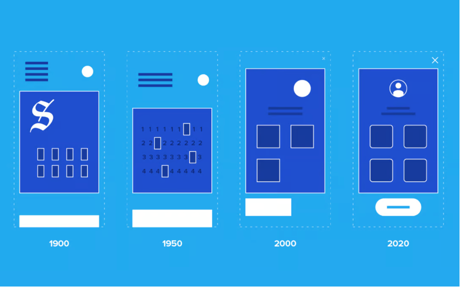
The user interface has evolved over time, as shown in the image above, becoming more human friendly. Today’s user interfaces frequently follow a hierachal structure, but they can become over designed, destroying the aesthetic.
The NEW trends
In the same way that user interfaces have evolved, so have the design trends that are used to attract and engage users of the platform for which the interface is intended.
1. Neumorphism – Flat design and skeuomorphism are combined in neumorphism. It is a visual style that combines background colours, shapes, gradients, and shadows to increase the graphic intensity of UI elements. All of this enables a soft, extruded plastic look and almost 3D styling.
Many designers believe it violates fundamental usability principles. It almost completely eliminates intuitiveness and accessibility. And there aren’t many real-world apps built in this style.
Example of neumorphism:
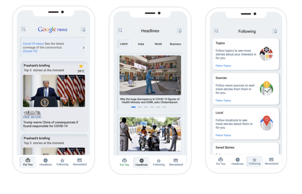
The design work shown above is a proposal for a new neomorphism-based Google News interface. I like the effects used to highlight each article, but I believe they may be confusing to some in terms of user experience and accessibility. Since the neumorphism design relies on low contrast to achieve its soft appearance, it can affect readability and make it difficult for users to identify buttons, icons, forms, and other important interface features.
2. Bold typography – One of the simplest methods for attracting users’ attention is bold typography. Bold typeface demands to be read because it stands out from the background. This technique has been embraced by many information sites, but if used excessively, it can be overwhelming.
Example of bold typography:
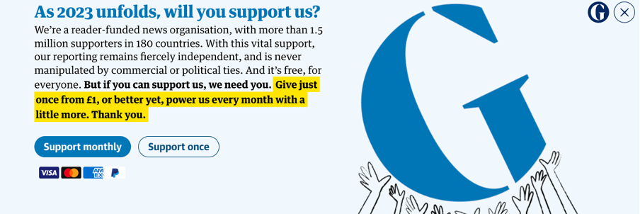
A perfectly balanced use of typography can be seen in the image above, which is from the Guardian newspaper. To ensure that the reader’s ability to read the text is unaffected, various font weights are used. To guarantee that the reader’s attention is drawn to a particular piece of text first, bold weights and a strong lighting effect are used. The layout also adheres to a clean hierarchical structure that balances text and images perfectly. Overall, I consider this to be a very good example of typography because it is subtle and not overdone with unnecessary extra design. This, in my opinion, is another factor contributing to the high level of public trust in the Guardian’s news reporting.
3. Smooth gradients – A gradient is a smooth transition between one or more colours on the canvas. Gradients are commonly used to create visually appealing and soothing backgrounds. A gradient colour canvas is smoother and highlights your content more than flat colours. It will also give your designs more depth, making them more memorable.
Example of smooth gradient:
Gradients are widely used in today’s user interface, but if they are used excessively on a website, the user experience can be ruined. To make icons and logos stand out and represent a platform or brand, it works particularly well. The result has a very contemporary vibe.
References:
Cavusoglu, E. (2021, February 20). 17 UX/UI Trends for 2021. UserGuiding. https://userguiding.com/blog/ux-ui-trends/
The New Trend in UI Design: an Overview of Neumorphism | Toptal®. Toptal Design Blog. https://www.toptal.com/designers/ui/neumorphic-ui-design#:~:text=interactivity%20to%20users.- (accessed 2023-03-19).
Powell, A. Web 101: A History of the GUI. Wired. https://www.wired.com/1997/12/web-101-a-history-of-the-gui/#:~:text=So%20where%20did%20the%20GUI.