
User interface on information sites.
As I mentioned in my proposal, I’ll be talking about why user interface should be unseen in my dissertation. I will, however, be concentrating particularly on information sites, such as the news, etc., as these sites are known to be visited by millions of users worldwide, so the user interface on these sites must be unseen in order to accurately spread information in an easily accessed way. I’ll go over examples of both good and bad user interfaces on various information websites below, along with suggestions for how to make the design better.
Bad Examples:
- Wikipedia : a free online online resource that is multilingual and is edited and updated by a community of volunteers.
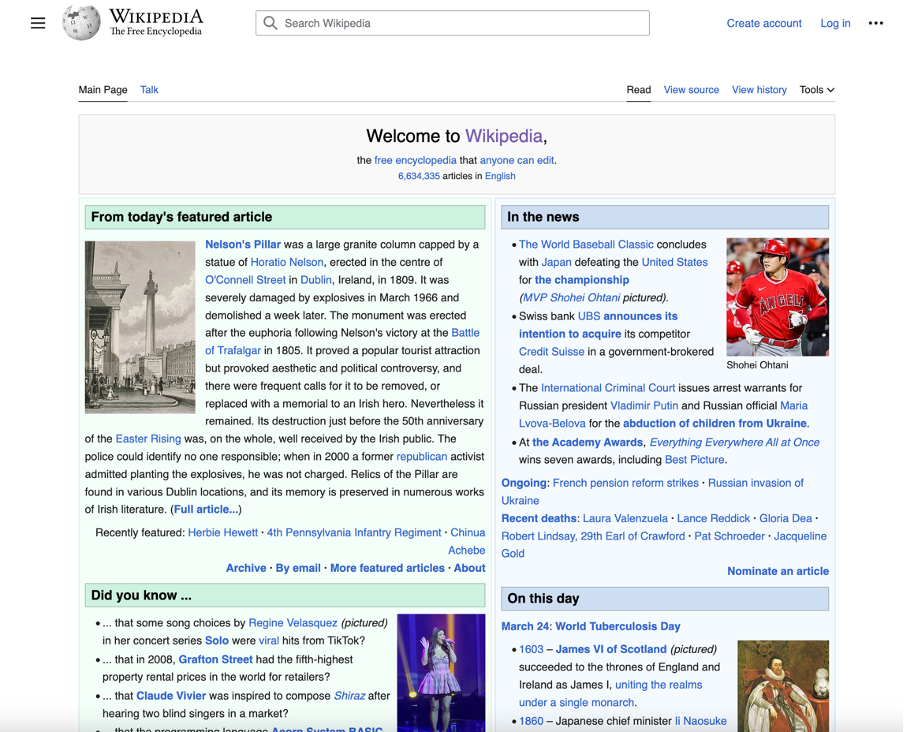
The user interface on the Wikipedia website is very overwhelming, lacks balance, and has no structure in terms of typography and visual presentation. A hierarchical structure would have allowed users to easily absorb information. In terms of design principles, it appears that they only used a grid column structure to store all of the information. The type is overly done.
To improve the site, I’d create a hierarchical structure with different font weights and colours to separate the information. To balance out all of the text and background visuals, I believe movement and proportion can be added.
–
–
2. IMDB : an online database of information related to films, television series and casts.
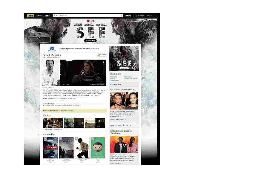
The Imdb website’s user interface is an example of overdone design. There is too much going on, which disrupts the user experience and the information displayed. There is little white space, colour, and very small font, as well as excessive ads, resulting in a cluttered layout that makes it difficult for users to complete their query.
To improve the site, negative space and a much better information structure would be beneficial to ensure text balance. I believe movement can also be considered because there is so much going on that it is difficult to know where to look first.
_
_
3. Daily mail: a daily middle-market tabloid newspaper and news website published in London.
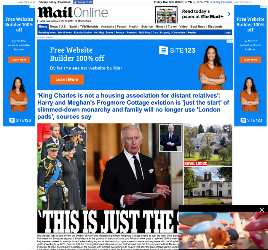
The use of hierarchy to display information on the daily mail is extremely good. The only problem is that the ads crowd the main body of the web page on both sides, making it difficult to read the content as you scroll down. The designers could change the proportions and placement of the ads to make them less invasive and not effect the user experience.
_
_
4. Craigslist: an American classified advertisements website with sections devoted to jobs, housing, for sale, items wanted, services.
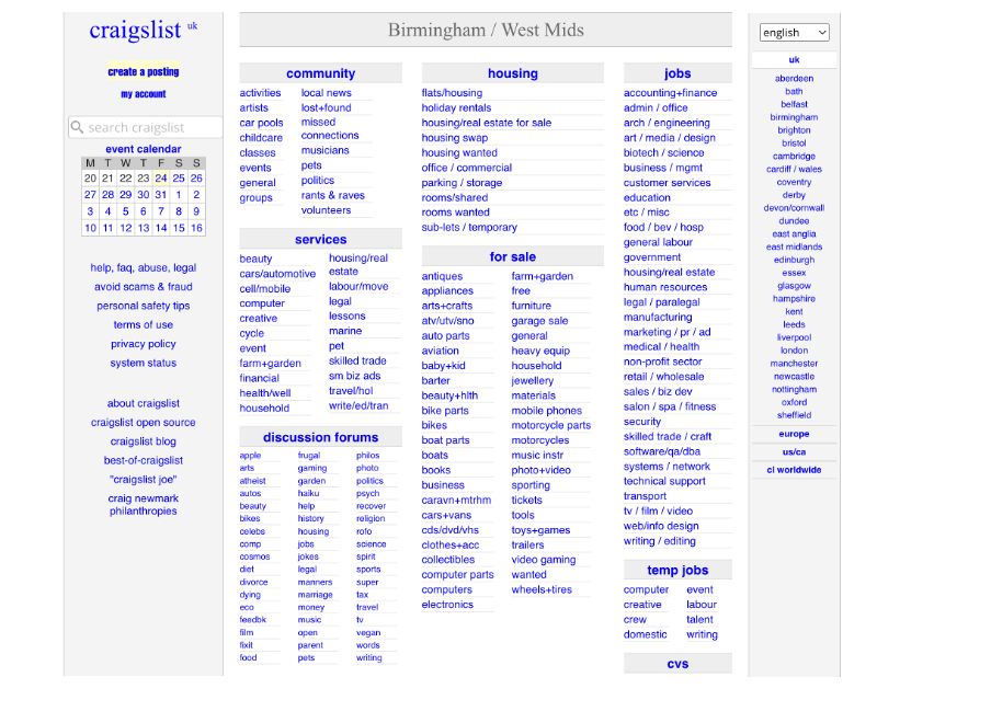
The craigslist website has a terrible user interface. Because of the heavy typography, the site lacks proportion and rhythm. The site is also not very responsive, and the overall design is unappealing. To improve the site, I’d add colour and experiment with proportion and emphasis to make different aspects stand out. In terms of the column structure and text, I also believe there is too much repetition.
–
–
5. Simcast: a news portal.
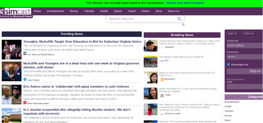
The Sim cast website’s design is overly cluttered. The text is overwritten and lacks any sort of hierarchical structure.
_
_
Good design examples:
1. BBC news:
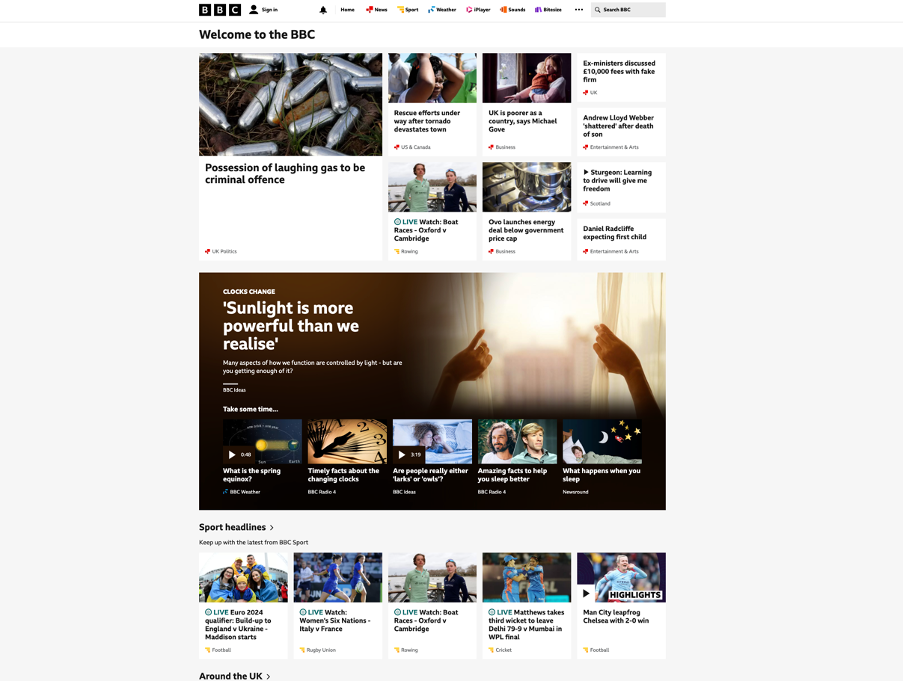
The BBC website is an excellent example of a unseen design. The website has a very clear hierarchical structure with a subtle balance. Proportion is also used frequently to separate text and allow certain parts to stand out, which is useful for emphasis. The overall design unites and works well together, providing a good user experience for users.
–
–
2. CBS news:
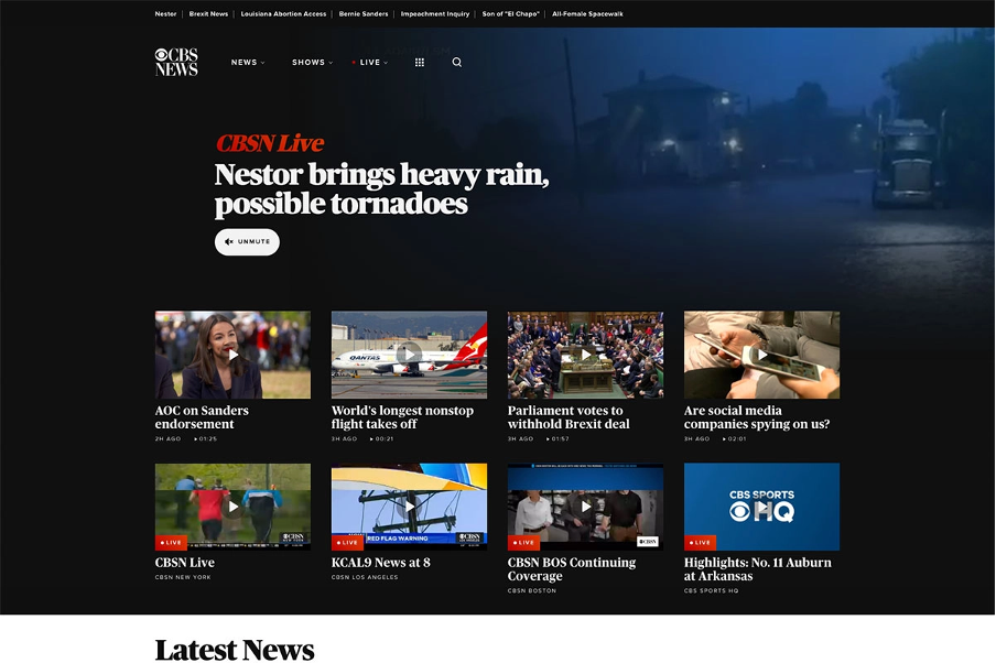
I really like the design of the CBS News website. The structure is clear and makes good use of rhythm and movement. The design also makes extensive use of proportion, which can be seen throughout the text. The typography follows a hierarchical structure, with different colours and font weights used to emphasise the importance of the text. Movement is shown in the background, where it faintly shows a live news reporting; this is very engaging and contrasts very well amongst the structure.
–
–
3. Al Jazeera news:
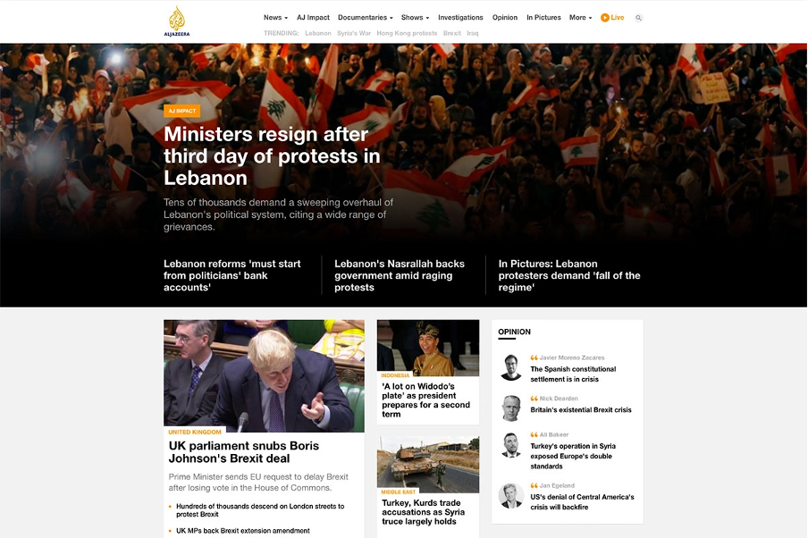
The website design for Al Jazeera is very clean, modern, and user friendly. The design is well-balanced and not overdone. The website features images as thumbnails with perfectly proportioned typography that explores a hierarchical structure to allow legibility. Tone and textures are also used to create contrast and make the images stand out.
–
–
4: Britannica
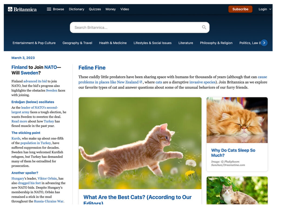
The Britannica website has a un seen user interface. The website is an online resource similar to Wikipedia, but the design is much better because the entire structure is well balanced. The design features a strong contrast between a hierarchical structure and white space, which works very well for the user experience.
–
–
5: The New Yorker:
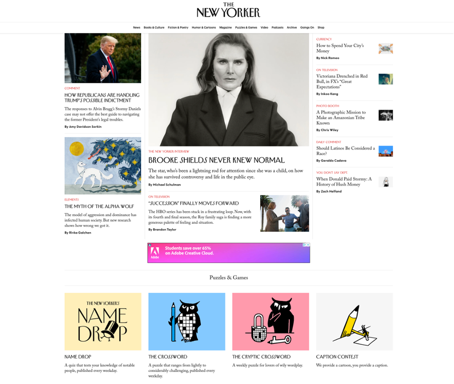
The user interface on the New Yorker website is very clear and well presented. The design makes good use of white space and rhythm, which enables legibility. The structure follows a hierarchy, making it easier for the viewer to absorb the information. Personally, I like the overall design because all of the principles work well together to provide a good user experience and aesthetic.
References:
Fitzgerald, A. 19 Examples of Bad Website Design in 2021 [+ What They Got Wrong]. blog.hubspot.com. https://blog.hubspot.com/website/bad-vs-good-design.
Colorlib. 18 Best News Website Designs For Inspiration 2021. Colorlib. https://colorlib.com/wp/best-news-website-design/.