
My dissertation proposal 👨🏻💻📑
My dissertation………………………
Since I’m particularly interested in the user interface and design industries, I intend to base my dissertation on user interface. In week 2 as a team, we had to form arguments to either agree or disagree with Beatrice Warde’s statement that “Good design should be invisible”. This task was very interesting to me as there were many counter-arguments to this statement that demonstrated it’s own importance from various perspectives.
For my dissertation, I’d like to take a modern 21st-century approach to Beatrice’s statement, focusing on user interfaces primarily on information sites. So, my statement will be , that user interface should be unseen. To form opinions, I’ll investigate different stages and the history of user interface design.
Chapter 1
For the first chapter of my dissertation, I intend to discuss the history and evolution of ui design in general, as well as how it has changed very briefly from the past to the modern 21st century.
I came across an article written by a designer named Danielle Reid in which she discusses the evolution of user interfaces and describes the world as our interface. In addition to this article, I will investigate the origins of user interfaces and the new trends that are being implemented to attract people.
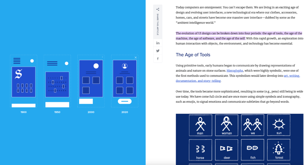
The article above shows the changes in user interface and how perception plays a role in it. Today’s design and layout are much more user-friendly and minimal. However, this can be overdone at times. So in this chapter i’ll briefly discuss design in the modern ui industry and all the trends that are sometimes overused, which ruins the purpose and overall aesthetic of the site.
Chapter 2
In chapter 2, I’ll look for examples of both good and bad user interface designs based on information websites. This will be used to support my point. I’ll compare the two sites and discuss what distinguishes them in terms of design by analysing the structure and how we’d interpret the information presented.
The main design principles I’ll look for in the sources I’ll use are hierarchy, balance, and white space. As I believe that combining these principles will result in a more clear and understandable design.
Citizendium and Britannica, for example, are both information sites with user interfaces that follow a hierarchical structure in terms of how the information is perceived.
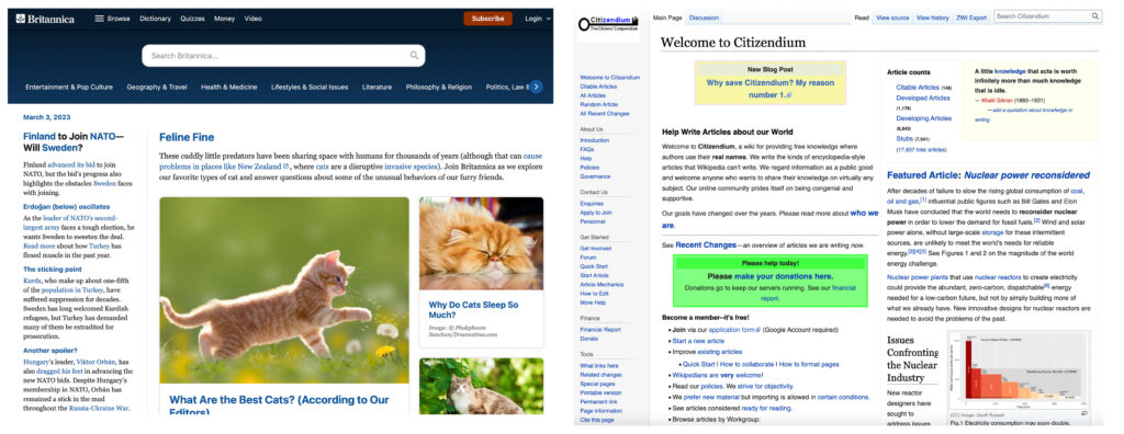
As a viewer and designer, I find the Britannia website to be far more engaging and friendly in terms of navigation and overall appearance it’s clear and straightforward. The use of accent colours, shadow effects, columns, and different font weights makes it interacting with the site more comfortable for me.
The citizendium site’s design appears to violate every principle – it’s overdone and lacks user experience.
Once I make my points I’ll maybe discuss how I’d personally make the website better if needed
Chapter 3
In Chapter 3, I’ll talk about user experience and how to use visual perception to make user interfaces successful, unseen, and friendly.
I’ll look for examples of information sites with just the right amount of visual perception and talk about the overall effect and the value of designers.
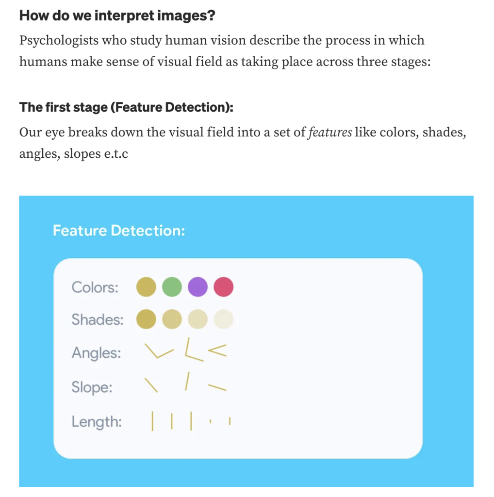
I discovered an article online that discusses how our eyes divide the visual field into features such as colour, shades, typography, angles, and slopes.
Many user interface sites use this to improve user friendliness.
Final Chapter
My dissertation’s final chapter will be a summary of my points and a discussion of whether I still agree with my statement about why user interfaces should be kept minimal and unseen.
References:
Reid, D. (2019, October 17). The World Is Our Interface – The Evolution of UI Design. Toptal Design Blog. https://www.toptal.com/designers/ui/touch-the-world-is-our-interface
Citizendium. (n.d.). http://www.citizendium.org/
Akindunjoye, O. (2021, December 7). Visual perception in user experience design – UX Collective. Medium. https://uxdesign.cc/visual-perception-in-user-experience-design-7943c97b14f4
Chapman, C. (2019, September 24). Breaking Down the Principles of Design (with Infographic). Toptal Design Blog. https://www.toptal.com/designers/gui/principles-of-design-infographic
Drowning the Crystal Goblet | Butterick’s Practical Typography. (n.d.). https://practicaltypography.com/drowning-the-crystal-goblet.html